Showing posts with label HUD. Show all posts

Tuesday, November 25

Diegesis

Why did nobody tell me about this before? Gamasutra posted up an article the other day by Gregory Weir about "Diegesis" and specifically its use in Grim Fandango. Yeah, I'd never heard of the word either.

Wikipedia offers a nice example definition:
Sounds in films is termed diagetic if it is part of the narrative sphere of the film. For instance, if a character in the film is playing a piano, or turns on a CD player, the resulting sound is "diegetic." If, on the other hand, music plays in the background but cannot be heard by the film's characters, it is termed non-diegetic or, more accurately, extra-diegetic.
This is what I've been talking about when I use the word "seamless" in the oh so many articles I've written concerning the topic. I wish I'd known the word earlier. Weir cites a number of great examples of diegesis in video games. Here is but one:
Metroid Prime, in fact, plays with diegesis via the game's very interface. By using the X-Ray Visor, it becomes clear that while the player selects Samus's weapons with the C Stick, Samus herself chooses weapons by moving her fingers into various positions.
Thank you Mr. Weir for bringing this term to my attention. Dear readers, this is why its important to have a good vocabulary.

Bridging the Gap

Many games today are striving for a seamless, immersive gameplay experience. Alone in the Dark, Dead Space, and Mirror's Edge are good examples. But then there is the other side of the coin, the side upon which video games were built: the statistical, fourth-wall breaking presentation. These are the video games that know they're video games and aren't afraid to let players know too. RPGs and Fighting titles still use stat-tracking heavily. The immersive games, meanwhile, have rid themselves of health-bars and HUDs in the hopes that players can feel emotionally unified with game and character and maintain an unbroken, seamless gameplay experience. Why the intention is noble, and I think successful, immersive games, in shunning their other half, may be losing something that could be equally, if not even more affective, at emotionally reaching players.

Part of Metal Gear Solid's charm has always been its blending of the immersive and the statistical. In Metal Gear Solid 4, Snake wields a plethora of stat-heavy weapons, the HUD has a camo-index to show how well hidden Snake is, the solid-eye offers different vision modes, and so on. But Metal Gear Solid 4 adds another stat too, one that goes miles in creating a tangible, emotion connection between player and character: the psyche gauge.

In Metal Gear Solid 4, the psyche gauge keeps track of Snake's mental and emotional health. When engaged in combat or being hunted down, the alert phase switches on and a stress indicator appears on screen, displayed as a percentage. As Snake engages in combat, his stress level rises, and his psyche gauge depletes. A full psyche gauge means Snake is ready for battle. But as the gauge depletes, Snake becomes distraught, stressed, and nervous; the game screen blurs and Snake's hands begin to shake, making for an unsteady shot.

For gameplay purposes, the psyche gauge tells players they need to find a more comfortable spot soon or eat some noodles or Snake's combat performance will suffer. The gauge even has its own codec frequency, Rose, who as a psychiatrist, explains the psyche gauge in depth and will offer Snake help if players call her when the gauge is low.But the psyche gauge does more than just add a layer of difficulty. As players engage in battle, fighting enemy mercenaries, they feel a certain way. Players feel emotionally stressed when the alert phase is on, whether they're trying to hide from an onslaught of soldiers or shoot every one that comes. And Snake feels stressed too; his stress indicator and psyche gauge very explicitly display this fact. From personal experience and from Rose's explanations, players recognize that Snake's faltering mental state will soon cause him to perform less effectively. As a result, players react with worry and try to replenish Snake's pyche so as to both continue the game and relieve their own stress over dying in-game. Perhaps players also feel bad for Snake, as the psyche gauge allows for easy comprehension of his mental trauma in experiencing the brutalities of war. The psyche gauge, in so accurately and immediately representing Snake's mental health, serves as an emotional bridge between player and character, as players can directly sympathize with Snake's situation.

Players have a love/hate relationship with the story-telling style of the Metal Gear Solid series. The games are both lauded for their amazing cutscenes and wracked for their over-reliance on them. Not much changed for Metal Gear Solid 4; the game still employs cutscenes abound to relay story. But the psyche gauge not only bridges gameplay and cutscene, but also allows for a very real, personal connection between players and Snake.The genius that he is, Kojima chose to carry over the psyche gauge from gameplay to cutscene. In a good number of cutscenes throughout the game, the psyche gauge will suddenly appear and deplete a bar. (SPOILERS!) For example, in a cutscene with Naomi, Snake learns he is to die soon, only after living his last couple of weeks as a walking nuclear weapon. Snake frowns, sighs, and slumps hs shoulders, visually showing his concern. (End Spoilers!) But the psyche gauge also immediately appears on screen and depletes a bar, with a sheeeooo sound effect to boot. The obviously disappointing news and the excellent-quality graphics are plenty able on their own to show Snake's emotional distrought. But the psyche gauge, a feature heavily employed in gameplay, is what really allows us to connect. Having personal experience with the psyche gauge during gameplay, players are able to strongly emotionally connect with Snake's stress and disappointment through the gauge's appearence, and I would argue even more so than through the game's graphics.

The psyche gauge is first a gameplay feature. It tells players that they Snake needs to view a magazine fast or he won't be fit to continue. The true power of the gauge, however, is its direct and clear link between Snake and players; acts as an emotional correlation between the two. As a gameplay feature, the psyche gauge breaks immersion, but it more than makes up for the loss in its capacity for emotional bonding. And though cutscenes are often bashed for their robbing of player control and limited ability to emotionally affect players, the psyche gauge serves to blend cutscene and gameplay and is a tangibly-felt design.

Thursday, October 30

Development of Presentation in Paintings of the Last Supper

I'm taking a Renaissance Art class here in Italy. It's my first art history class ever, and I'm really enjoying it. Yesterday, we looked at Leonardo da Vinci's very famous the Last Supper, and particularly in comparison to earlier renditions of the gospel story. And to what tract of thought did this analysis lead, why game design of course. I'm no art history expert, so my commentary here will be highly limited, potentially incorrect, and mostly taken from my textbook and the comments of my professor, Dr. Adrian S. Hoch.

Leonardo da Vinci's presentation of message in his fresco of the Last Supper was highly innovative for its time; there is a reason the artist introduced the High Renaissance era of artwork. Whereas earlier paintings of the story employed contrived, blatant symbolism, da Vinci eschewed these methods for a more naturalistic, seamless conveyance of message.

Let's look at three earlier paintings, all of the Last Supper.

Last Supper, Tree of Life, and Four Miracle Scenes. Taddeo Gaddi, 1360. In the Refectory, Santa Croce, Florence
Last Supper, Andrea Del Castagno, 1447. In the Cenacolo of Sant' Apollonia, Florence.Last Supper, Domenico del Ghirlandaio. 1480. In the Refrector, Ognissanti, Florence.All of three of these paintings came before da Vinci, all ascribe to a similar form, and all convey the gospel messages through similar means. We need to review the gospel story in general before we go on. These paintings depict the last supper of Jesus story found in the Synoptic Gospels of the New Testament. The story recounts Jesus' final meal with his twelve disciples, one of whom, Judas, would soon betray him for greed. Also notice how the apostle John is asleep atop the table. The major themes are all presented in the same way throughout each of these three paintings. And their message is effective; the depictions clearly present the story.

Most obviously, Judas, the betrayer, is sitting on the opposite side of the table as Jesus and the rest of the disciples, clearly setting him apart as different. Furthermore, Jesus and eleven of the disciples are painted with halos; Judas, meanwhile is bare-headed, indicating his sin. These messages are clear and well-portrayed. But they're also a bit blatant. Leonardo da Vinci changed all of this.

Last Supper, Leonardo da Vinci. 1495-1497. Refectory of the convent of Santa Maria delle Grazie, Milan.
The differences between da Vinci's painting and that of his predessecors and contemporaries is stunning. Leonardo depicts the moment exactly as Jesus states that one of his apostles shall betray him. The apostles are all painted with extreme motion and emotion, each reacting heavily to Jesus' pronouncement. The extremity of facial expressions could have been drawn from Ghirlandaio's painting, as the History of Italian Renaissance Art notes. But unlike previous paintings, da Vinci places Judas on the same side of the table as the rest of the apostles.

But this does not mean we can't identify which apostle is Judas. Far from it, we can find Judas three figures to Jesus' right, covered in shadow, drawn back in horror, knowing and afraid of his guilt. With one hand, Judas grasps the money back given to him for his betrayal. With the other, he reaches for a loaf of bread, as written in the Gospel of Luke. Furthermore, the apostle John is no longer sleeping, and gone are the circlular halos. This I think is particularly apt point in regards to game design. Jesus is naturally haloed by the window behind him. The effect is a naturalistic, seamless one, not bogged down by the triteness of blatant circles.

All of these paintings are excellent. But da Vinci took the established standard and compltely surpassed it. Whereas before, symbolism, message, and theme were conveyed through obvious representations in the painting, e.g. Judas on our side of the table, visible haloes, da Vinci managed to present these exact same messages naturally: Judas in shadow and in shock, Jesus haloed by the window light.
I think its clear what I'm getting at. Video games are moving fast towards a more seamless presentation of information. Look at the very recent Alone in the Dark, Far Cry 2, or Dead Space. All of these titles eschew the traditional HUD in favor of a more natural, realistic, in-world presentation. Alone in the Dark has an inventory system wherein players look at the pockets of their vest. Far Cry 2 keep players in-line with the vision of the character at all times: when he gets into cars, when he pulls shrapnel out of his body, etc. Dead Space displays information on Isaac's back or on the hologram in front of him, which is visually skewed as the camera is rotated, nor does the game wrest control from players. The upcoming Mirror's Edge places movement in the first-person-perspective like never before. Players can see, hear, and feel Faith's running limbs and wheezing breath. Are we now moving towards our own High Renaissance of Video Games? All of these games are doing amazing things, and as time goes on, as we enter the next-generation of video games only 2 or 3 years from now, the bar is certain to raise ever higher.

Sources:
History of Italian Renaissance Art: Painting, Sculpture, Architecture 6th Ed. by Frederick Hartt and David G. Wilkins. Published by Prentice Hall, 2007.

Andrea del Castango painting from Wikimedia.

Gaddi , Ghirlandaio, and da Vinci paintings from the Web Gallery of Art.

Dead Space image from Gamespot.

Tuesday, December 4

Seamless Presentation

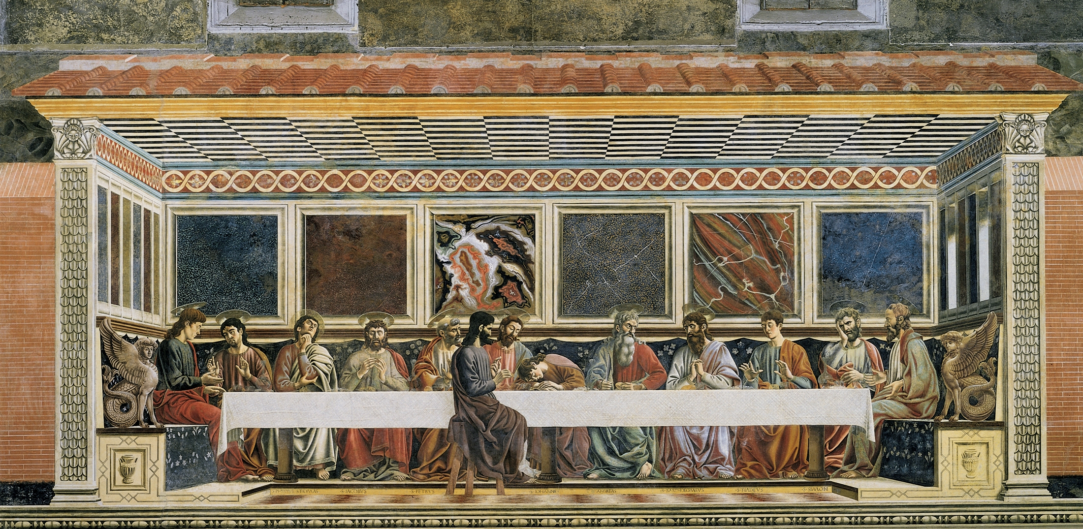
When Michelangelo sculpted The Pieta, he chose to make the figure of Mary larger than that of Jesus. This decision by Michelangelo was that of a specific presentation. Michelangelo is showing Mary as prominent over Jesus, literally, through her size. This unique presentation of a classic Biblical relationship leads admirers to reflect upon The Pieta's meaning and the significance of Michelangelo's decision.Game design encompasses the same issues of presentation and meaning. Like sculpture, painting, or music, game design is an art open to possibilities and options. Presentation is one aspect of design that is increasingly paramount in importance, and only limited by designers' imagination in terms of all the forms it can assume. As with all aspects of game design, a game's presentation must be designed in cooperation, or along with, the remainder of its elements. While there are countless ways of presenting information to players, the zeitgeist of gaming is shifting towards a more seamless approach. This shift reflects the western gaming culture's expectations of next-generation gameplay. Seamless presentation, as opposed to other approaches, is unique in its pursuit of an ideal immersive gameplay. These terms are synonymous; the choice to present a game seamlessly is the desire to create a highly immersive gameplay experience. Seamless presentation is by no means the be all, end all, of game presentation, but it is certainly a viable approach that is rapidly becoming more and more popular in the design community.

But what exactly are designers looking to present anyway? The answer is everything. For truly, presentation is a continuum. For the purpose of discussion, though, I've divided presentation as a whole into three parts: information, theme and story, and interaction. I will briefly discuss each of these points individually, then expound upon these basic explanations with specific examples from modern video games. As rivulets flow together to form rivers, once these three elements are presented in a similar seamless manner, they mesh and cooperate with one another to create a whole, immersive gameplay experience.Players need information to play a game. The style of presentation is the form in which any given information is fed. The most common form of information conveyance is the HUD, or heads-up-display. Generally, the HUD includes things like resource statistics, the ammo of a firearm, or the health of a character. And even simple information like these can be presented in varying forms. Take for example a vehicle's speed in a racing game. Designers can choose to feed this knowledge to players with a speedometer, or through a more simple numerical count.

But rudimentary information is not all that needs presenting to players. We all know games are more than just lives and top scores. Games evoke emotion. They have stories and plot lines and themes. Games have characters, landscapes, and environments. All of this must be presented to players. The original format for story presentation was the text-scroll. “All your base are belong to us” was as effective as it got back then. But technology has improved. And with it, game design. Since the days of text-scrolls, the continuous arrival of superior technology has inspired new opportunities for different kinds of presentation. The next-gen systems offer previously impossible or unavailable possibilities. Seamless presentation is profiting the most from these advancements.

The last area of presentation is interaction, which many would likely argue is the largest contributory element to gameplay. The presentation of interaction refers to how, or in what ways, players effect, manipulate, or respond to a game through control. Video games have always been about interaction. But just like other aspects of the medium, interaction can be presented in various ways. As we delve deeper into the next-generation of video games, a more immersive seamless approach to interaction is beginning to take hold.
The HUD or user-interface has been around since games were invented, but video games are increasingly presenting this very same information in a more seamless manner. One example is Lionhead Studios' Fable 2. The game is yet to be released, but already it is apparent that most everything the RPG has to offer will be presented with immersive gameplay in mind. This presentation includes seemingly basic information like player location and navigation. In Fable 2, players assume the role of young boy during his growth into hero or villain. During the game, players are accompanied by a pet dog to train, play, and fight with. The dog is more than just some superficial addition; governed by complex artificial-intelligence, dog and player can complete realistic and intelligent interactions. In his 2007 Game Developer's Conference presentation, Peter Molyneuax, head of Lionhead Studios and lead designer of Fable 2, demonstrates and discusses the dog as a functional aspect of gameplay.

“We ask what is his job here. What sort of gameplay can we get out of this dog? His job at this stage, he stays in front of me. That's very important. Quite often with co-op characters in games they stay to the side of you, or behind you. He's in front, he's scouting, he's looking for treasure, he's looking for new things. That's very important.”

“You'll notice that something is missing in this [television] screen. And what is it? It is, it used to be here [pointing to the top-right of the game screen], the mini-map. God I hate that thing. I hate the fact that in Fable 1, you could play the whole of Fable 1 with the mini-map. The millions of pounds and hundreds of hours of work that we put in the world were worth nothing cause you were playing the whole thing on the mini-map. Can we get rid of that mini-map? Can't he be your guide [pointing at the dog]? When you come to a junction like this can he point you down there? Now he's not a complete solution, but he's a partial solution.”

The mini-map is a standard piece of game presentation. It shows players their relative position, their surroundings, and usually their destination as well. And it serves these purposes nicely. But as Molyneuax suggests, the mini-map is so convenient, it actually interferes with a players' immersion in the game world. The dog in Fable 2 achieves the same purposes as the mini-map, but presents them in a much more seamless fashion. Instead of a mini-map showing a bird's-eye view of nearby paths, the dog will run ahead of players and actually trace the paths out and, to the best of the AI's knowledge, dynamically lead players to their destinations. Moreover, the dog, being a dog, has heightened senses and will recognize the presence of nearby enemies, and as any good hunting dog would, will bark and alert players to their presence. This is contrasted with red dots representing enemies on a circle in the corner of the screen. The dog is just one example of Fable 2's seamless presentation. The dog immerses players in their surroundings through player-interaction and the emulation of a real-life creature. At the same time, the dog is seamlessly presenting to players vital gameplay information with its behavior.

A second game offering seamless presentation of information is Valve's soon to be released Team Fortress 2, an online-multiplayer first-person-shooter. Team Fortress 2 is all about class-based team competition; players join opposing teams to fight as any of nine different character classes. Each class plays differently, possessing several inherent strengths and weakness that deign them either prone or resilient to other character types. Therefore, it is essential that players immediately acknowledge who are their allies and also who are their enemies. Team Fortress 2 is a fast paced game, players need to process player-class identity quickly to tactically adapt to any situation. To achieve this end, Valve employed a unique, pervading art direction which was fully-integrated with gameplay. In an “illustrative rendering” video featurette, a Valve team-member discusses the art design of Team Fortress 2:

“Through very intentional art direction, this goal was supported by designing characters with distinct silhouettes that can be easily identified even with no lighting cues. The body proportions, weapons, and silhouette lines were explicitly designed to give each character a unique silhouette. In the shaded interior areas of the characters, the clothing folds were designed to echo silhouette shapes in order to emphasize the silhouettes as observed in the commercial illustrations which inspired our designs.”
The individual character models are directly incorporated into the game world and gameplay, making for a seamless presentation of meaningful information. This art direction is not limited to characters alone but is indeed applied to the game's entirety, including an allowance for quick discrimination of team color and map location:

“For the architectural elements of the world associated with each of the two teams, we defined specific contrasting properties. While the red teams architecture tends to use warm colors, wooden materials, and angular geometry, the blue teams buildings are composed of cool colors, industrial materials, and orthogonal forms.”

By designing gameplay around a united art direction, Valve is immersing players more fully into Team Fortress 2. Valve's greatest achievement is their integration of gameplay with visuals. Every aspect of the game works in concert to both immerse players and give them the information they need to play well.

As we discussed before, information is only one area of game presentation. Our second type is equally important: theme and story. An excellent example of this is Shadow of the Colossus, an action-adventure title designed by Fumito Ueda and developed by Sony's SCEI studio. Shadow of the Colossus is about self-discovery, and more importantly, is about self-discovery through gameplay. Several themes are presented to the player via seamless means; among these are solitude and compunction.

In Shadow of the Colossus players become a man known only as “Wander.” The player's only mission is to resurrect a girl named Mono. To complete his quest, Wander must destroy sixteen different colossi, gigantic living stone creatures. With the help of a horse named Agro, players explore and traverse an expansive world to individually locate and defeat each beast.
In their search, players are meant to feel alone, isolated. In addition to the main character's name, Ueda presents this isolated feeling in a few ways; all of which are very simple but highly effective. In all of the game world there are only two characters aside from Wander and Agro. This in itself makes for a feeling of loneliness, being unable to interact with other people. A second effect is the size and desolation of the game landscape. Wander is dwarfed not only by the colossi but by the environments as well. The environment is constructed largely of big rock cliffs and deep, long valleys, presenting to players a sense of barrenness and emptiness. The third technique is silence; there is never music playing while Wander and Argo are traveling the land. Only the sounds of hoof beats and wind are emitted. These elements of desolation are naturally integrated into the world, seamlessly presenting a feeling of isolation to players.

Another game that has fantastic presentation of story and theme is Irrational Games' (now known as 2K Boston) recently released BioShock. BioShock takes place in desecrated underwater city called Rapture. What was intended to be a paradise has been destroyed by greed and madness. During their exploration of Rapture players must find a way to survive while searching for the reason behind the city's fall.
Players are wholly immersed in the world of BioShock. Visually, aurally, and interactively, players experience Rapture as if it were real. The story is presented to players primarily through audio-clips, being one of the most advanced pieces of technology available to Rapture. These audio logs were recorded by individuals of Rapture and are strewn throughout the game world, waiting to be discovered on desktops, dead-bodies, and enemies. Players are able to play each tape they find and as they do so learn more and more about Rapture's history. The varying denizens of Rapture offer differing accounts and perspectives of the city, allowing players to formulate their own opinions. This piece of story presentation is both functional and natural, immersing players in the game world while at the same time conveying necessary and interesting information about it.

As players explore Rapture they discover the primary theme of BioShock: no place is perfect for everyone, there is no eden for all. Players realize this theme through personal experience simply by walking through Rapture . Rapture is falling apart, ethically societally, and literally. Rapture was built to last forever, underwater and separated from other imposing societies. But in the cities negligence and metaphorical implosion, the beauty that was has been all but destroyed. Statues of grandeur once lining the walls are now nothing more than heaps of broken stone. Paintings are torn, wood is splintered and burning, the entire city feels forsaken. Even worse, the walls are leaking. No matter how well contained they build Rapture there will always be leaks.
The world of Rapture and this play experience serves to reflect the game's themes. Levine and the team at Irrational Games are presenting to players a world of moral corruption by allowing them to directly and representationally experience the effects of Rapture's greed. BioShock immerses players in Rapture with immaculate graphics and sound effects, seamlessly presenting players the story of Rapture and the themes and messages meant to be taken away.

The final point of seamless presentation is interaction. One title that has become very popular this past year exemplifies seamless interaction quite well: Wii Sports. Nintendo's Wii was specifically designed to be highly interactive and Wii Sports takes advantage of this goal quite well. Wii Sports is actually five games in one, featuring simulations of sports titles tennis, golf, boxing, bowling, and baseball. While some of these simulations are more successful than others, they all were designed with the same principle in mind: immersive interaction. With Wii Sports, Nintendo is presenting an alternative to analog sticks and buttons; they are presenting interaction that is more involving and in effect more seamless in its emulation of real-life activities.
In the tennis side of Wii Sports players swing the Wii remote as if it were an actual tennis racket, and similarly in baseball mode, swing the controller like they would a bat. In golf, players tee-off and putt as if holding a club. The remote becomes a virtual ball in bowling. And in boxing players grip and punch the nun-chuck and remote like they are truly throwing hooks.
Naturally, each of these games require different input methods or swings to play. But Nintendo designed the game to be simple renditions of each sport. Nintendo chose to present the games such that players can intuitively grasp the means of interaction. A controller pad as an interface does little to imitate playing tennis; swinging a remote, however, is physically fairly close to actually swinging a racket. By closely emulating reality, and requiring more active input on part of players, Wii Sports avoids the seams of button configurations and instead allows players to become immersed in their gameplay experience.

My final example of seamless presentation, and of seamless interaction, is Okami. Okami was released this time last year and developed by now disbanded Clover games. Players of Okami become sun goddess Okami Amaterasu in the form of a white wolf. The fantasy world of Okami has been invaded by a demon named Orochi and infested with a dark substance, polluting the land in a purple haze. Like Team Fortress 2, Okami was designed with very distinct, pervasive art direction inspired by the sumi-e painting style. The world's landscape is like a painting of its own, formed of large brush strokes and colored with pastels. Amaterasu exists in a living painting. Though this is cool in itself, the amazing thing about Okami's art style is how it crosses the gap from being purely aesthetic to wholly interactive.
As Amaterasu, players possess whats called a celestial brush that allows them to interact with and directly effect the game world. By holding R1 the screen becomes a canvas for painting. Manipulating the face buttons and analog stick, players are able to maneuver a paint brush and interface with the canvas as they please. Brush strokes from a finished canvas are transposed into the game, assuming form, shape, and function. Painting a line through the ground, for example, will create a stream of flowers, while painting a dot will plant a seed that quickly sprouts into a tree. Throughout the game, players learn new brush techniques which allow for new and helpful interactions. Painting a circle in water will create a large lily pad for Amaterasu to stand on; painting a spiral will create wind that blows out fire; and filling in the broken gap of a bridge will repair the damage.

Clover has synergized art-style with interaction. The celestial brush not only matches this feeling but is integral to gameplay, allowing players to naturally transform their painted world as needed. Okami is not special in allowing players to interact with the world, but rather is so for its presentation, the style by which players interact. The immersion as a player is derived from painting on a world that looks and feels just like a painting. Okami allows players to interact with the game seamlessly, using a paint brush as a means to affect a painted landscape.

Presentation is the form in which information is appropriated to players. Seamlessly presenting information is to do so in an immersive manner, allowing players to feel more absorbed within the game. I could go on about the dialogue system of Mass Effect, or the free-running or Assassin's Creed, or the minimalistic style of Defcon; but if we simply open our eyes we will see more clearly how many games involve players more completely and bring about a rich, enthralling gameplay experience for them. By seamlessly presenting information, story and theme, and interaction, we can immerse players more fully into our games and come that much closer to meeting, even exceeding, our definition of next-gen gameplay.

Image Sources
The Pieta
GRAW 2
Team Fortress 2 Characters
Team Fortress 2
Okami
Fable 2
Bioshock
Wii Sports

Thursday, July 5

Army of Two: The Ties that Bind

Army of Two has been a long time coming, and it wasn't until this week that we knew all that much about the game, thanks to 1up's week long cover feature. Army of Two is developed by EA Montreal and was designed from the beginning as a completely cooperative experience. Whether playing with realistic AI or an actual human, with Army of Two, EA Montreal is set out to reinvigorate the cooperative shooter.We've discussed cooperative games before, in an overview, really, of what they're all about. EA Montreal's main goal was to create a game that required players to play cooperatively. In the 1up preview, Senior Producer on Army of Two explains their premise:
Gears has a really cool co-op experience, too. But what we've been really looking at is 'How do we take what those games have done' -- and I don't want to take anything away from those guys; they've done a really cool job, but it's always just been the add-on -- and figuring out 'How do we make a game where co-op is the focus?
Their solution is a game where in two players take control of two soldiers, named Salem and Rios, working for a private military corporation (PMC). The setting and story is actually really interesting and definitely worth reading about in 1up's various previews and interviews. The point, though, is that the two soldiers (players) must work together to make it through the game. How has EA achieved this requisite realiance on the other player? Well, a big part is something they've designed called the Aggro Meter. Aggro isn't new to games by any means. You'll find it MMO's most prominately, where monsters will swarm players who happen to cross they're path. But Chris Ferriera isn't kidding when he says we've never seen Aggro in a shooter before. This is how it works: players share an Aggro Meter that is displayed across the top of the hud. Its called a meter because thats exactly what it is, just like a speedometer or ticket meter. During the game, the meter pin will swing left or right towards one extreme or the other, each end capped by an icon representing either Salem or Rios.
The meter will swing based on a number of things, but primarily how angry the enemies are. The more attention a player draws to himself, the more aggrevated the enemies will act towards that player. If players blatantly run and gun towards the enemy, naturally, the enemy isn't going to be happy and will start focusing their fire on that character. The other player, meanwhile, may be more reserved in his approach, obviously the enemy will not be as concerned about the player that is seemingly less of an immediate threat, and will focus on fire on the other player. As a result, the pin on the Aggro Meter will swing towards the more aggressive player. Drawing the enemy's attention away allows the other player to, as an example, circle around and shoot the enemy from behind. Alternatively, both players could play aggressively and run guns blazing into the firefight. In this case, the aggro meter may be centered and the enemy fire will be focused on both players. In game, as a player becomes more aggro'd against, his character will glow red. As a character aggrevates an enemy less,on the other hand, he will become slightly transparent. This allows players to differentiate between the two characters' aggro state without looking up at the hud.

Their have been coop games before. But what EA is trying to do is make this a cohesive, neigh, central feature of Army of Two. The aggro meter is EA's answer to cooperative gameplay. The aggro meter is affected by more than just making enemies angry, Army of Two has a big customization system that plays into the meter as well. The game allows players to outfit and customize guns and equipment to great extent, just how the players customize their weapons is what effects their aggro draw, shall we say. For example, if players outfit a gun with a silencer, then shooting at enemies will draw less aggro than it would have without a silencer. A counter example, if players bling out their guns with gold plating, then the enemies are gonna get angry more easily thanks to the player's blatant arrogance. But thats good. For you see, players will have to communicate before each level to decide who will be taking what kind of equipment. One player may want to play stealthily, the other may want to play haughtily. And customizing characters to draw more or less aggro, on average, allows player to strategize about how they're going to cooperate later on, and eventually form their play experience.The aggro meter is a clear design choice that allows players to cooperate at their best. Players will constantly be balancing aggro by drawing and retreating from fire. Aggro allows players to manipulate the enemy to take them out. Working together and using aggro properly will be completely necessary to win each stage. I think that EA Montreal has a fine looking cooperative shooter on their hands, it will be fun to see just how well the aggro works come game time.

Monday, December 11

Pogo Sticker

Hello, I just downloaded an awesome game. Its called Pogo Sticker and it was developed by Skinflake. You too can download the game at this convenient hyperlink.

Pogo Sticker is very simple, but really fun and challenging without being too insanely difficult. Featuring twelve different levels, your goal is to reach the end in a side-scrolling manner. But unique to Pogo Sticker is that you do so by bouncing. The character you play as is basically a three jointed pogo stick. His features include a bouncy ball foot, a big round body, and head wearing a very helpful helmet. You may also play as a taller green model with four apendages, making the game more difficult.

All Pogo (this is what we shall call him) can do is bounce, in fact, thats naturally what he is constantly doing. Bouncing is to Pogo as breathing is to us. You control Pogo by moving the mouse to his right or left, causing him to lean his body weight in that direction. Also, clicking the mouse will increase Pogo's bounciness. The more you click the mouse, the harder he will bounce. And, the level of bounciness will fade or drop over time until Pogo is bouncing as lightly sa he can again. The game features very fine physics that seemingly determines all of this. You are able to shift Pogo's weight in the air influencing his direction and tilt. Tilting Pogo is essential to getting him to land right, otherwise he will fall face first into the ground.

There are a couple of other things I want to bring up. There are two ways to lose. One is if you fail to keep Pogo bouncing. The other is by draining Pogo's life bar. When Pogo hits a surface with his head, his life will go down. The other thing is, when you click the mouse to increase Pogo's bounciness, bars will be added to a meter on the left hand side of the screen. This is certainly helpful for the player as it allows him or her to monitor its strength and adjust mouse clicks accordingly. However, what I wanted to ask is: Is this necessary. Now, I'm not saying the bar isn't necessary, as it is helpful. But lately games have been featuring HUDless (or minimal hud) gameplay. Without the bounce meter, players would be able to determine Pogo's bounciness just by looking at him and gauging his speed and time lapsed between bounces. Maybe that sounds complicated but really I'm sure it would be quite natural.

What do you think? Go and play the game, enjoy yourself, then come back and let us know if you think the bounce meter is necessary or not.
Im gonna go beat Pogo Sticker. Only two more levels!

Source: Skinflake.