
Leonardo da Vinci's presentation of message in his fresco of the Last Supper was highly innovative for its time; there is a reason the artist introduced the High Renaissance era of artwork. Whereas earlier paintings of the story employed contrived, blatant symbolism, da Vinci eschewed these methods for a more naturalistic, seamless conveyance of message.
Let's look at three earlier paintings, all of the Last Supper.
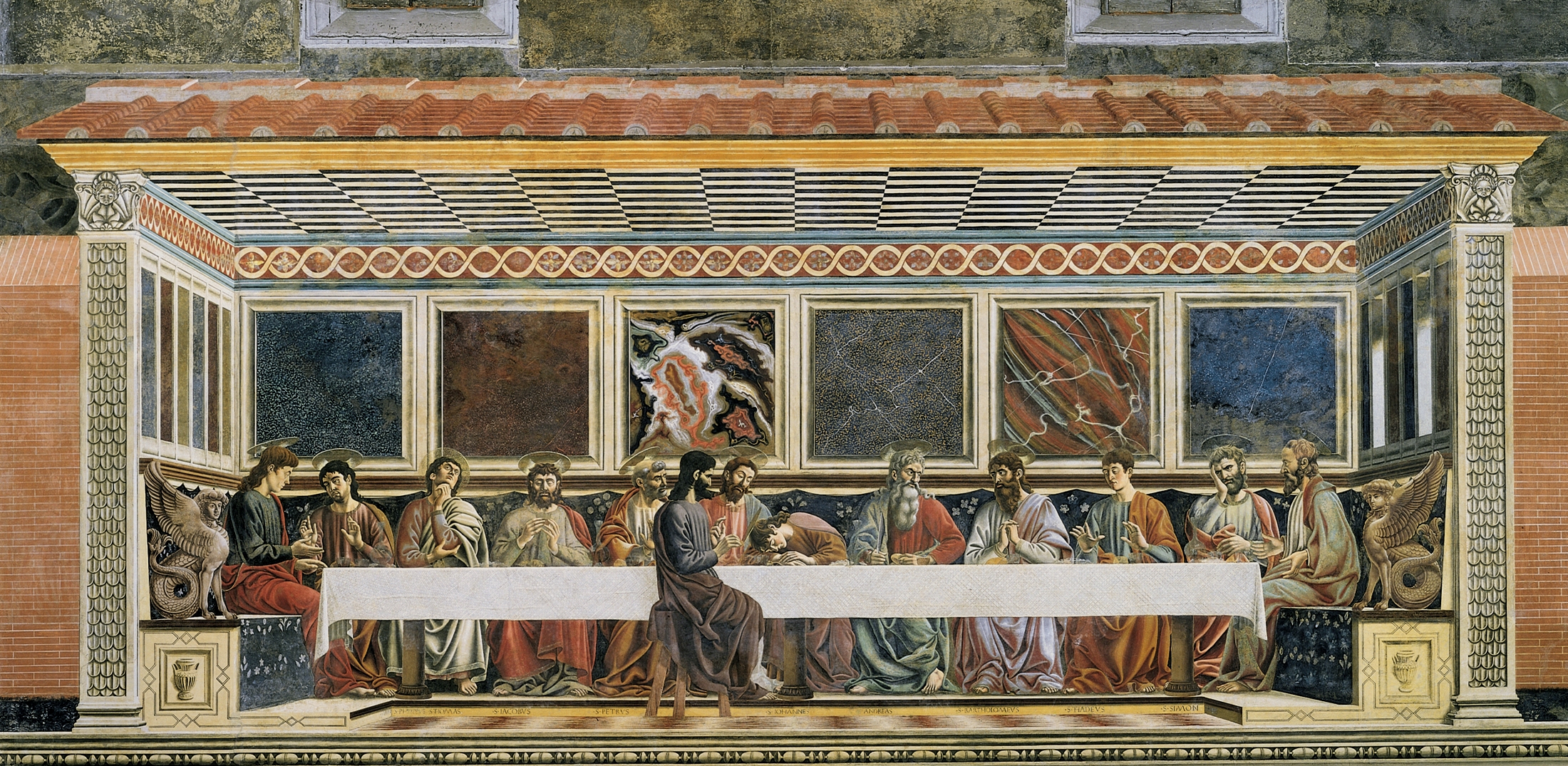
Last Supper, Tree of Life, and Four Miracle Scenes. Taddeo Gaddi, 1360. In the Refectory, Santa Croce, Florence
 Last Supper, Andrea Del Castagno, 1447. In the Cenacolo of Sant' Apollonia, Florence.
 Last Supper, Domenico del Ghirlandaio. 1480. In the Refrector, Ognissanti, Florence.
 All of three of these paintings came before da Vinci, all ascribe to a similar form, and all convey the gospel messages through similar means. We need to review the gospel story in general before we go on. These paintings depict the last supper of Jesus story found in the Synoptic Gospels of the New Testament. The story recounts Jesus' final meal with his twelve disciples, one of whom, Judas, would soon betray him for greed. Also notice how the apostle John is asleep atop the table. The major themes are all presented in the same way throughout each of these three paintings. And their message is effective; the depictions clearly present the story.
Most obviously, Judas, the betrayer, is sitting on the opposite side of the table as Jesus and the rest of the disciples, clearly setting him apart as different. Furthermore, Jesus and eleven of the disciples are painted with halos; Judas, meanwhile is bare-headed, indicating his sin. These messages are clear and well-portrayed. But they're also a bit blatant. Leonardo da Vinci changed all of this.
Last Supper, Leonardo da Vinci. 1495-1497. Refectory of the convent of Santa Maria delle Grazie, Milan.
 The differences between da Vinci's painting and that of his predessecors and contemporaries is stunning. Leonardo depicts the moment exactly as Jesus states that one of his apostles shall betray him. The apostles are all painted with extreme motion and emotion, each reacting heavily to Jesus' pronouncement. The extremity of facial expressions could have been drawn from Ghirlandaio's painting, as the History of Italian Renaissance Art notes. But unlike previous paintings, da Vinci places Judas on the same side of the table as the rest of the apostles.
But this does not mean we can't identify which apostle is Judas. Far from it, we can find Judas three figures to Jesus' right, covered in shadow, drawn back in horror, knowing and afraid of his guilt. With one hand, Judas grasps the money back given to him for his betrayal. With the other, he reaches for a loaf of bread, as written in the Gospel of Luke. Furthermore, the apostle John is no longer sleeping, and gone are the circlular halos. This I think is particularly apt point in regards to game design. Jesus is naturally haloed by the window behind him. The effect is a naturalistic, seamless one, not bogged down by the triteness of blatant circles.
All of these paintings are excellent. But da Vinci took the established standard and compltely surpassed it. Whereas before, symbolism, message, and theme were conveyed through obvious representations in the painting, e.g. Judas on our side of the table, visible haloes, da Vinci managed to present these exact same messages naturally: Judas in shadow and in shock, Jesus haloed by the window light.
 I think its clear what I'm getting at. Video games are moving fast towards a more seamless presentation of information. Look at the very recent Alone in the Dark, Far Cry 2, or Dead Space. All of these titles eschew the traditional HUD in favor of a more natural, realistic, in-world presentation. Alone in the Dark has an inventory system wherein players look at the pockets of their vest. Far Cry 2 keep players in-line with the vision of the character at all times: when he gets into cars, when he pulls shrapnel out of his body, etc. Dead Space displays information on Isaac's back or on the hologram in front of him, which is visually skewed as the camera is rotated, nor does the game wrest control from players. The upcoming Mirror's Edge places movement in the first-person-perspective like never before. Players can see, hear, and feel Faith's running limbs and wheezing breath. Are we now moving towards our own High Renaissance of Video Games? All of these games are doing amazing things, and as time goes on, as we enter the next-generation of video games only 2 or 3 years from now, the bar is certain to raise ever higher.
Sources:
History of Italian Renaissance Art: Painting, Sculpture, Architecture 6th Ed. by Frederick Hartt and David G. Wilkins. Published by Prentice Hall, 2007.
Andrea del Castango painting from Wikimedia.
Gaddi , Ghirlandaio, and da Vinci paintings from the Web Gallery of Art.
Dead Space image from Gamespot.


No comments:
Post a Comment